 Print Design
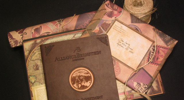
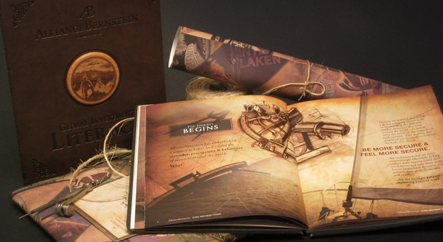
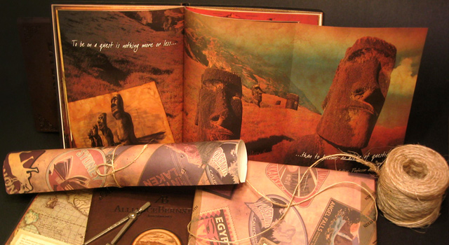
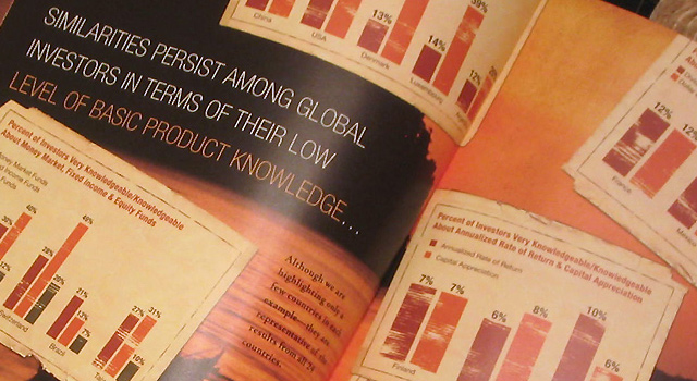
Global Investment Research Book
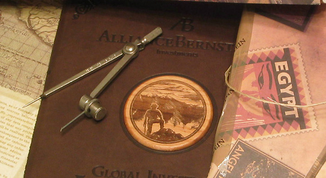
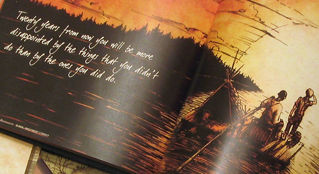
ERA404 worked with a prominent NYC-based Investment Company and Creative Director, William Imboden, to create a 60-page, leather-bound book to document the culmination of a year’s worth of global investment research. The book featured 35 charts, 12 original illustrations (including a three-spread, full-color rendering of Tom Sawyer on the Mississippi), laser-etched cherry wood medallions and tons of research information and photography.Read More
Irwin Entertainment Stationery System
Upon completion of Irwin Entertainment‘s Hero Logo Animation, ERA404 was asked to design/produce the NYC-based production company’s stationery system.
The design, which was featured in PrintCritic, pushes the envelope of their energetic, bold identity.
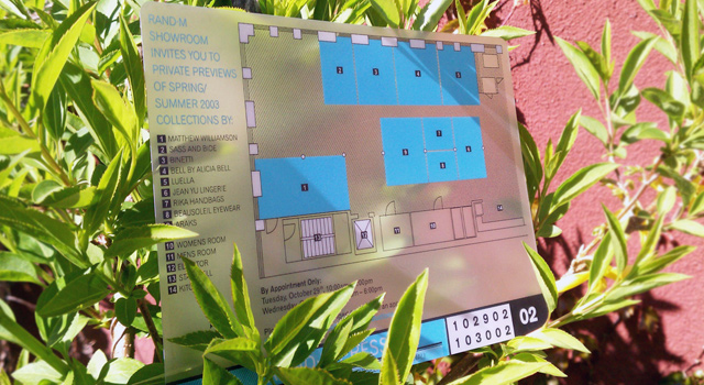
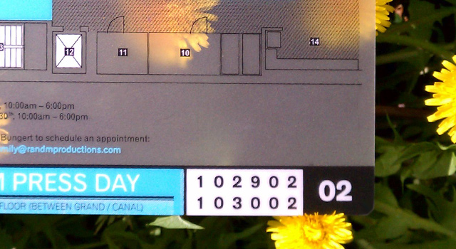
RANDM Press Day Invitation
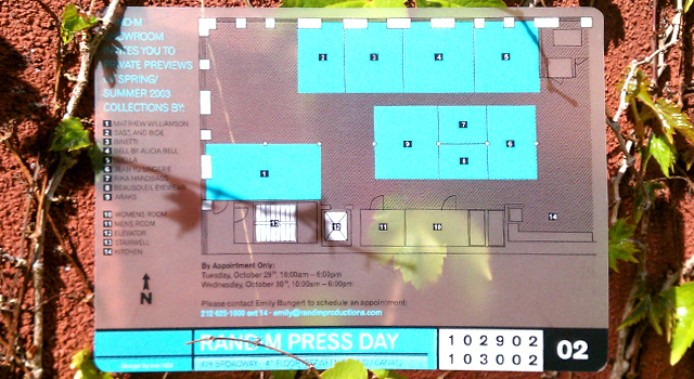
Design for translucent card and envelope for RANDM Press Day 2003.
“I am always amazed at what ERA404 creates! The quality of work is excellent. The turnaround on each and every project was amazing.”
Rand Burrus, President
Target Benchmarks Central Park
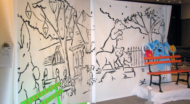
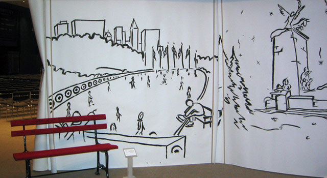
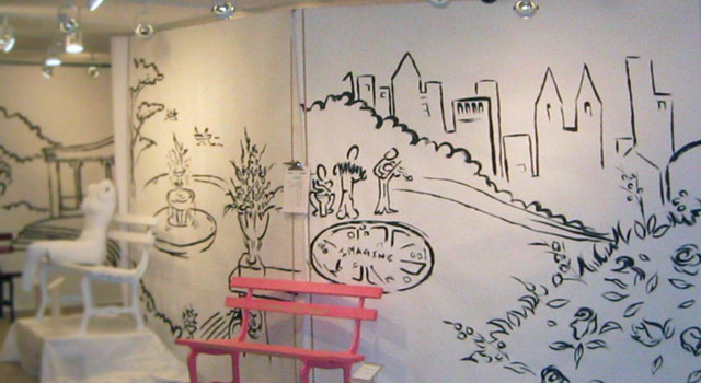
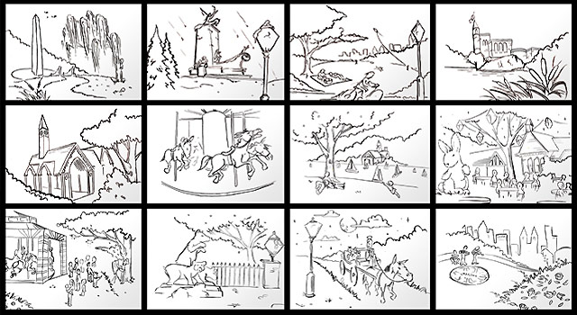
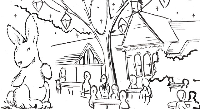
Rand Burrus, of RANDM, approached ERA404 to design Target’s philanthropic event for the Central Park Conservancy, Target Benchmarks Central Park. ERA404 created twenty (20) 8′ x 8′ murals as backdrops for the benches, four (4) 5′ plexi-glass displays and all the event signage, including banners that hung on Central Park lightposts.
Phoenix Identity System
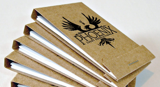
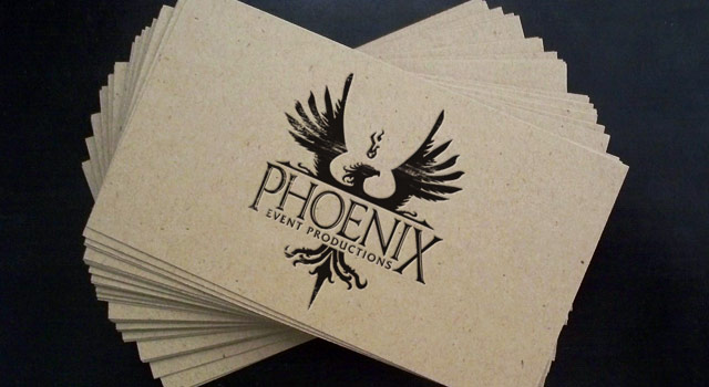
Rand Burrus is known throughout NYC for his unique and creative vision in designing and producing events. So when he approached ERA404 about an identity for his new company, Phoenix Event Productions, we knew that this image needed to be as impactive as his work.
The final identity was derived from a gothic representation of a phoenix being reborn.
“I am always amazed at what ERA404 creates! The quality of work is excellent. The turnaround on each and every project was amazing.”
Rand Burrus, President
Phoenix Event Productions
ERA404 Regular Typeface
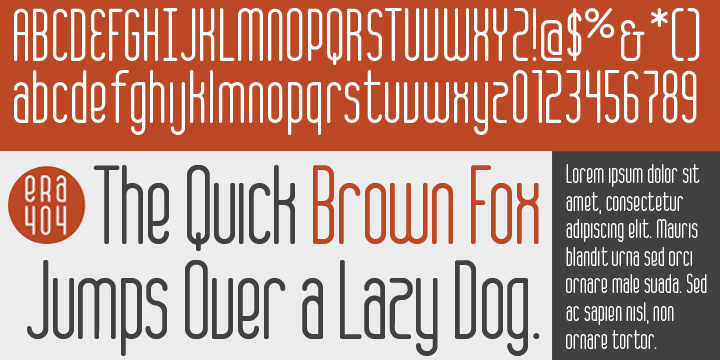
ERA404 is pleased to announce the release of our new typeface, ERA404 Regular. The font was designed around our new logo and branding campaign, as a response to requests from designers and artisans within our network and our clients. It is now available for download on MyFonts in opentype format (Mac and PC).
About the Typeface
The new typeface complements the shape and strength of the graphic elements incorporated into ERA404’s new identity system. Each of the six disciplinary icons, which can be seen on the rebranding press release page as well as throughout the www.era404.com site, each begin with a circle. This shape, which symbolizes strength, is also meant to imply the genesis of the idea at the center of all work we do. As each icon “grows,” the idea begins to take shape. In all of our disciplines—print, identity, digital, motion and environmental design, as well as development and strategy—the idea remains our central focus toward growing new pieces. This concept is quite literally depicted in our disciplinary icons.
Continuing with this concept, the main logo for ERA404 was also redesigned to be encapsulated in the circle, effectively portraying the studio as an “ideas company.” The typeface was designed as an amalgamation of the rectalinear disciplinary icons and the circular, central focus. This gives ERA404 a nice balance between the rigidity of many condensed sans-serif faces and the graceful arcs traditionally seen in script or serif fonts. Recommended primary usage is for headlines and signage, however it may also work for body copy in some applications.
Licensing and Usage
The font, designed by ERA404 Creative Director, Don Citarella, is free for personal use, however we request that designers inquire about usage licensing for all commercial applications and restrict any sale or resale of the face. For more information on how ERA404 Regular may be implemented into your design work and signage, please contact ERA404, here.
Recommended Links
- « Previous
- 1
- 2
- 3


