

Press Releases
Herb Ritts at Home
April 12, 2020 - Press Releases
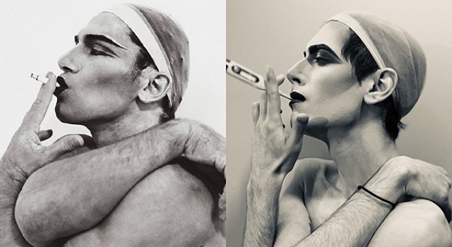
Herb Ritts Foundation (@HerbRitts), together with ERA404 Creative Group (@ERA404), just launched their #HerbRittsAtHome campaign on Instagram, asking followers to recreate one of Herb’s iconic photos while sheltering at home during the Corona Virus pandemic. The campaign encourages fans to match the composition of one of their favorite photos with objects, props, and outfits found inside the home.Read More
ERA404 to Sunset PANTONE Moods
March 16, 2018 - Press Releases

In late 2008, ERA404 approached PANTONE about creating a Facebook application that allowed users to match color chips with their current mood. The application was launched the following March and featured prominently in HOW Design magazine and on Pantone.com.Read More
Bulc Club Eliminates Spam with Social Networking
August 12, 2016 - Press Releases
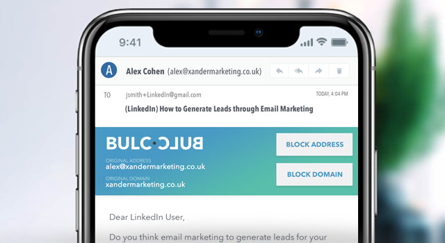
Free New Service Crowdsources Ratings of Email Senders to Block Unwanted Mail
The Herb Ritts Foundation Launches New Website
November 6, 2015 - Press Releases
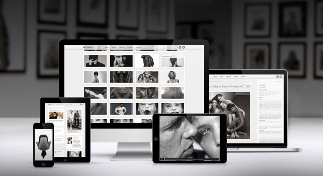
Los Angeles—HERBRITTS.com features the largest collection of the late photographer’s work online, while offering the opportunity to explore every aspect of his career.
Dozens of editorial examples, advertising tear sheets, book spreads, and museum installation photos mixed together demonstrate how Ritts’ work embedded itself into popular culture.
In addition to producing portraits and editorial fashion for Vogue, Vanity Fair, Interview and Rolling Stone, Ritts also created successful advertising campaigns for Calvin Klein, Chanel, Donna Karan, Gap, Gianfranco Ferré, Gianni Versace, Giorgio Armani, Levi’s, Pirelli, Polo Ralph Lauren, and Valentino among others.
The site features an interactive timeline of Herb Ritts’ life. For the first time, visitors are able to see examples of Ritts’ directing work including award-winning music videos and commercials. Further insight is offered into the Foundation’s history and mission: to advance the art of photography and support HIV/AIDS causes in a manner that reflects the spirit and values exemplified by Herb Ritts during his lifetime.
Designed and developed by ERA404 Creative Group, the site allows visitors to conduct advanced searches through Ritts’ vast archives and follow the Foundations social media presence.
Herb Ritts’ iconic images have been exhibited in museums worldwide, including hugely popular exhibitions at The Museum of Fine Arts, Boston and The J. Paul Getty Museum in Los Angeles.
(via HerbRitts.com)
Recommended Links
- Visit: HerbRitts.com
- ERA404 Portfolio: Herb Ritts Foundation
- ERA404 Work: Digital
ERA404 Helps Vessel Crew Become a Little More Social
October 31, 2014 - Press Releases
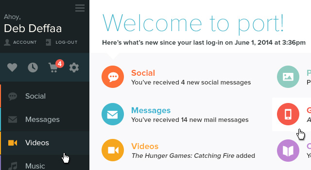
NEW YORK—This summer, Deb Deffaa of Trident Networks contacted ERA404 with an idea to bring the world of social networking to the crew of seafaring vessels. And while the logistics seemed mind-boggling, the idea sounded more than intriguing.
In 2011, the 360 commercial ports of America, alone, took-in goods worth $1.73 trillion. There are more than 100,000 ships at sea, carrying between 12 and 110 crew members. Each laborer signs-on for contracts lasting 4-6 months. And while many of the sailors have families at home—be it Germany, Panama, The Philippines, or somewhere in between—they need to keep in touch with expensive satellite phone calls and with limited access to email. Shore-leave time dwindles at just a few hours, giving them little ability to even set foot in the countries where they deliver their precious cargo. And their view through a porthole window always replays the same footage of the middle of the ocean.Read More


