

News Articles
Designing Data

When ERA404 first hung out its shingle, we quickly found ourselves entrenched in a world of marketing and promotion. Clients would approach us about viral marketing campaigns to spread the word on their new novels, transforming sales spaces to better draw shoppers to their new products, and create cohesive printed collateral material to promote their new businesses. Our designers predominately worked with these businesses’ sales forces with the simple goal of creating an authentic connection with their customers.
There’s certainly nothing wrong with this. In fact, a portion of the design work we do – and will always do – is sales. We, ourselves, design with this goal in mind. You might say that’s even the basis for this newsletter.
However, scrolling chronologically through our portfolio, you’ll begin to notice a shift in focus. Over the last few years, more and more clients have approached us to create workflows and processes to increase understanding beyond just converting browsers to buyers.
They have data. They’ve done research. They’ve collected feedback and information. They’ve aggregated content from multiple sources. They’ve accrued statistics, documents, measurements, and reports which could change the course of their business, their lives, and the world. If only they had a way to make it more understandable.
ERA404 Mobile App Design and Development Read More »
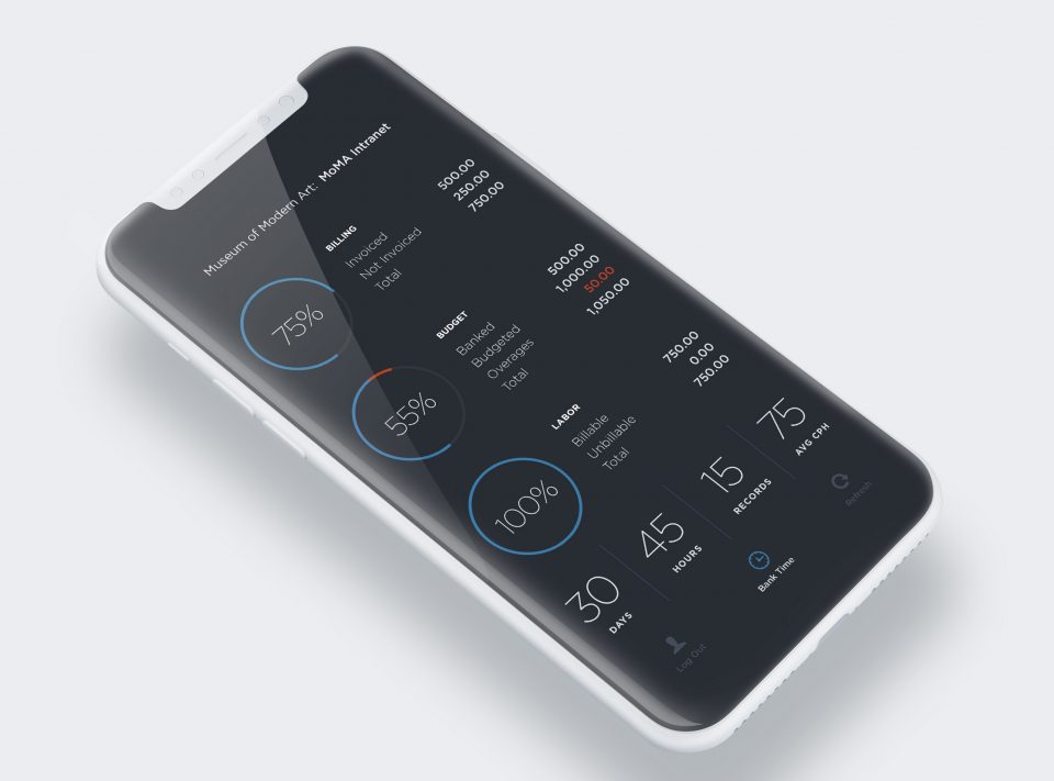
We soon found ourselves working with a vast array of data sets. A grant allowed us to map the magnitude of crimes and justice, broken down by city block in New York City. Another allowed us to create data visualizations of media assets across a span of cloud services. There were spring graphs of ancestral photos in family trees, analysis of frequency of words (and non-words) in Tweets, labor and overtime records compiled from a dozen disparate worksites, timelines of important biological dates and events, folksonomy contributed ratings of solicited vs. unsolicited email, pie charts and donut graphs matching color chips to current moods, arrays of network nodes and software manifests, geographical and financial charts of bankrupt businesses and outstanding assets and liabilities. ERA404 designers evolved from organizing messaging to data visualizing. And, while the fundamental center of design is always communication, the content had changed drastically.
We’ve grown to love data. Not just designing it, but using it to communicate as well. Each data set has a problem to solve, a story to tell, a lesson to learn, and a way for us to understand each other better.
If you have your own data, have found it to be unwieldy and unrefined, are struggling to extract meaningful feedback, hope to use it to forecast the direction of your business or confirm assumptions you’ve been making, endeavor to harness its power to drive your decisions, strive to simplify, clarify, visualize, translate, and/or interpret its meaning, or just want to make it work for you, then please drop us a line. Maybe we can help you love data, too.
Permalink: https://www.era404.com/news/designing-data/


