Search Results for: identity
First Funds 15-Second Teaser
Following the creation of First Funds‘ identity and stationery system, ERA404 continued this campaign through the launch of a new web site and customer portal for their clients, printed/collateral literature and tradeshow booth concepting.
Newsletter
ERA404 is a multi-disciplinary design, development, and strategy studio based in New York City. Subscribe to our quarterly newsletter to receive updates on ERA404 work and accomplishments.Read More
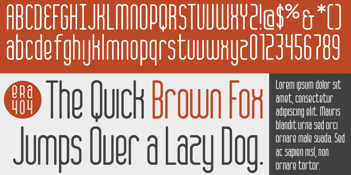
ERA404 Regular Typeface
ERA404 is pleased to announce the release of our new typeface, ERA404 Regular. The font was designed around our new logo and branding campaign, as a response to requests from designers and artisans within our network and our clients. It is now available for download on MyFonts in opentype format (Mac and PC).
About the Typeface
The new typeface complements the shape and strength of the graphic elements incorporated into ERA404’s new identity system. Each of the six disciplinary icons, which can be seen on the rebranding press release page as well as throughout the www.era404.com site, each begin with a circle. This shape, which symbolizes strength, is also meant to imply the genesis of the idea at the center of all work we do. As each icon “grows,” the idea begins to take shape. In all of our disciplines—print, identity, digital, motion and environmental design, as well as development and strategy—the idea remains our central focus toward growing new pieces. This concept is quite literally depicted in our disciplinary icons.
Continuing with this concept, the main logo for ERA404 was also redesigned to be encapsulated in the circle, effectively portraying the studio as an “ideas company.” The typeface was designed as an amalgamation of the rectalinear disciplinary icons and the circular, central focus. This gives ERA404 a nice balance between the rigidity of many condensed sans-serif faces and the graceful arcs traditionally seen in script or serif fonts. Recommended primary usage is for headlines and signage, however it may also work for body copy in some applications.
Licensing and Usage
The font, designed by ERA404 Creative Director, Don Citarella, is free for personal use, however we request that designers inquire about usage licensing for all commercial applications and restrict any sale or resale of the face. For more information on how ERA404 Regular may be implemented into your design work and signage, please contact ERA404, here.
Recommended Links
ERA404 Regular Typeface
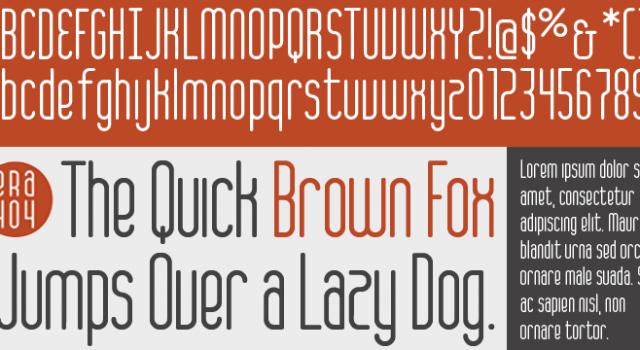
ERA404 is pleased to announce the release of our new typeface, ERA404Regular. The font was designed around our new logo and branding campaign, as a response to requests from designers and artisans within our network and our clients. It is now available for download on MyFonts in opentype format (Mac and PC).
About the Typeface
The new typeface complements the shape and strength of the graphic elements incorporated into ERA404′s new identity system. Each of the six disciplinary icons, which can be seen on the rebranding press release page as well as throughout the www.era404.com site, each begin with a circle. This shape, which symbolizes strength, is also meant to imply the genesis of the idea at the center of all work we do. As each icon “grows,” the idea begins to take shape. In all of our disciplines—print, identity, digital, motion and environmental design, as well as development and strategy—the idea remains our central focus toward growing new pieces. This concept is quite literally depicted in our disciplinary icons.
Continuing with this concept, the main logo for ERA404 was also redesigned to be encapsulated in the circle, effectively portraying the studio as an “ideas company.” The typeface was designed as an amalgamation of the rectalinear disciplinary icons and the circular, central focus. This gives ERA404 a nice balance between the rigidity of many condensed sans-serif faces and the graceful arcs traditionally seen in script or serif fonts. Recommended primary usage is for headlines and signage, however it may also work for body copy in some applications.
Licensing and Usage
The font, designed by ERA404 Creative Director, Don Citarella, is available through MyFonts.com and subject to their licensing, warranties, limited liabilities and EULA. For more information on how ERA404 Regular may be implemented into your design work and signage, please contact ERA404, here.
Recommended Links
ERA404 Creative Group Rebranding
Commemorating Their 10-Year Anniversary, ERA404 Gets a New Identity
ERA404 Creative Group, a long-standing creative studio based in New York City, is unveiling the company’s new corporate identity this quarter. ERA404 (formerly era//404) has made the choice to update their 10-year-old mark, its supplemental iconography and palette, even the company name.Read More
Behind the Design: Brooklyn Style
HOW International Design Annual
“Many wine drinkers select wines in part because of the label,” says Creative Director, Don Citarella about his recent designs for the Brooklyn Wine Co.’s Feliz White and Red. “Our main goal was to entice customers to take that first sip. Afterward, the wines speak for themselves.”
To appeal to both Brooklynites and wine connoisseurs, the labels for two of the eight varieties, which will be released over the next two years, feature an image of Brooklyn’s iconic bridge.Read More


