

site
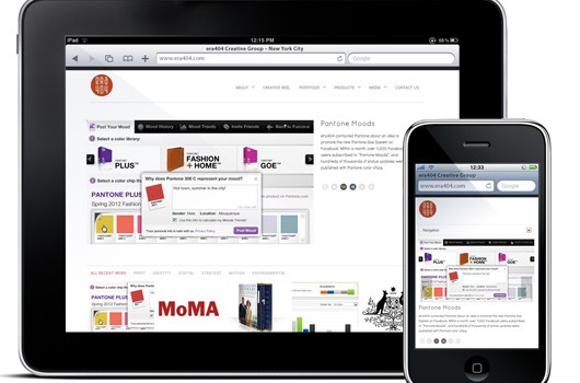
www.era404.com Site Relaunch
May 21, 2012 - Press Releases
NEW YORK CITY—ERA404 Creative Group, Inc., the New York design, development and strategy studio, is pleased to announce the launch of its newly revamped website, portfolio and client portal.
The new www.era404.com showcases selected work from the past decade of business and is part of a strategy to reposition themselves as leaders in multi-disciplinary creative and forward-thinking development. The site features an online portfolio, creative reel and dozens of other HD videos that make use of HTML5 and browser-native players, eluding the requirement of plugins for Adobe® Flash and Apple® Quicktime videos. Each page of the site is saturated with social media options (Facebook, Twitter, Pinterest, and Google Plus) and the site has been re-engineered to be optimized for search engines, RSS feeds, Facebook OpenGraph, mobile (and tablet) devices and responsiveness to multiple browsers/platforms/resolutions.Read More
Building a Better Mouse-Trap
February 22, 2007 - Press Releases
Transitioning from Website Interface Design to Application Development
In the Spring of 2002, I was hired to design an application for an events producer interested in sending out online invitations to events for the fashion industry. My client and I sat down and discussed the framework for the service that would eventually become an online contact and events management system. While I’ve had significant experience developing graphical user interfaces (GUIs) for Websites and portals, this was my first design for an online application or click-and-mortar business.
My assumption at that time was that it wasn’t much different from designing a Website GUI. An application, like a site, would need to feature information architecture (IA) that was both intuitive and easy-to-use. The design strategy should take into consideration user tasks and functionality to stovepipe from general to specific. In my mind, I imagined the design to be similar to the IA of a site, where navigation items give way to sub-menus for the very same purpose. Afterall, all we are really trying to do is trap their mouse, attract new customers and sell new ideas.
The original branding of the application, called Reserve-U, was based on the 1930s era Automat. My client and I discussed that an application like this would empower users to take control of their contacts databases and sort and slot data for their own purposes. The design strategy evolved to use zeitgeists of the time—vivid, though muted colors, clip-art icons derived from magazines, and plastic and chrome graphic elements similar to those on malt shops and drive-in theatres.
Stemming from this foundation of a branding campaign, I moved forward to design the application as I traditionally begin Websites. The Homepage of the application presented users with two options: contacts and events. Upon clicking in, the user was brought to a sub-section where a dashboard of links allowed them to navigate to specific functions. The entire design was characteristically driven by grey and green tables with headers similar to the layout for popular social networking sites, such as Friendster and MySpace. The links, designed in an orange accent color, drew focus and urged the user to proceed through the various tasks of the application.
Reserve-U was launched later that Summer and PR firms and Events Producers contacted us about the application to replace patchwork systems built using FileMaker Pro, or the array of customer relationship managers (CRMs) and mailing list tools that they used. Their main interest was derived from their desire to use an application built to encompass all their industry needs and designed the way they work. Because of this interest, I had no reason to doubt my new-found skills as an application GUI designer.
As clients began to lease the application, however, some negative feedback also surfaced. Naturally, as many designers might be inclined to do, I dismissed the criticism as user ignorance. “These people aren’t really Web-savvy and don’t understand online applications and the limitations of the Web.” My ego intact, we continued to lease the application and wait for the voices to die down.
It took another year of client reactions to realize that I might have misjudged their pleas for a better application. Designers thrive on critiques. While positive feedback is always nice for a good ego-stroking, the negative criticism is really what enables us to excel, to grow and to learn from our mistakes. I’d stubbornly ignored a valuable resource for education and forfeited my opportunity to create a tool that was intuitive and easy-to-use. This realization led me to begin collecting the criticism that clients had willingly provided and even to send out questionnaires to pinpoint flaws in the application. My analysis of their comments revealed that the issues centered on the following three problems.
Extensibility
As Reserve-U began to grow, new application functionality was added to existing screens, patched into intermittent pages and band-aided on functions with previously-different purposes. The workflow of the application that had once been so function-driven was now a beehive. Users were forced into sub-sections of Reserve-U to perform tasks that weren’t intuitively part of their parent category. A logical process required them to click three levels deep into one section, re-route to a different section, and find the results redirected in yet another. New functionality added to one table was either ignored in another, or applied differently. Clients couldn’t find functions to perform the tasks they needed and, when they could, were unable to predict the results.
Workflow vs. Dashboards
My initial intent for Reserve-U was to mirror the Automat theory by creating a landing page for its different sections. This enabled the user to perform as many tasks as possible with the least amount of mouse-clicks. The thought process was to direct the users by using the accent color on the links. These dashboard pages ended up more of an eyesore as the orange links increased and took over. The tasks were arranged based on their time of inclusion and not intuitively grouped or listed by common use.Originating from the aforementioned extensibility problems, tables became unruly messes, squeezed into a hard-coded width and linked to unpredictable functions.
Essentially, users found themselves bombarded by links that didn’t define a logical workflow. In my effort to list functions at user’s fingertips, I lost regard to organizing them by use frequency and speed, thus trapping mouses from performing relatively simple tasks.
Design Limitations
As the technologies for Cascading Stylesheets (CSS2), AJAX and DIV-oriented site design grew, the site was pigeon-holed into using hard-coded values that obstructed its aesthetic. Each page had a content-area (defined at 600px) and a help area (squeezed into 200px) to assist users with smaller screen resolutions. My logic of focusing on the least common denominator and allowing help to be consistently present was derived from working with corporate clients afraid of losing visitors. I hadn’t realized that application development could allow for two key differences:
Application Service Providers (ASPs) could:
1. dictate required specifications for optimal use (browser, plug-ins, resolutions)
2. train user practices instead of rely on worst case scenarios
Even worse, I had used my experience as a pretense to misjudge client aptitude. Why present help on every page, taking valuable real estate, when I could simply train users to toggle its visibility? Why not offer a help section in a different area, rather than context-sensitive assistance on each page? If a user prefers 800×600 on Internet Explorer 5.0, must my application cater to their preference?
Furthermore, many Reserve-U clients were fashion show producers or PR firms that represented fashion designers, so aesthetic was significantly more important than it would be in traditional sites or applications. While this isn’t to say that color palette and branding elements are unimportant for your average Websites, their impact is elevated among clients that deal with aesthetic on a day-to-day basis. The industry equated form with function. While the site may have been designed well, it didn’t feel trendy. In my target audience’s minds, it isn’t a far leap to believe it didn’t operate well, either.
Further digestion of this analysis proved that a redesign wasn’t only suggested, but crucial to the application’s success. Mouse-clicks were lost, users felt trapped, and confidence was sacrificed. If I was interested in truly building an application that made it easy for events producers and PR firms to work, I would really need to start from square one to build a better mouse-trap.
Rebirth
In Summer 2005, Reserve-U was reborn as Lyrek. The application was redeveloped from the ground up to embrace our clients’ valuable feedback and introduced a whole new IA, interface and technologies.
Information Architecture (IA)
The IA was redesigned to focus on client workflow, rather than the dashboard mentality. Hallway pages were excluded and extraneous mouse-clicks were removed. Navigation was simplified and focused on common tasks.
The workflow environment allowed us to add information prompts to drive users in order of necessity with messages like “You must create the invitation for this event before you can invite attendees.”
Branding Design
The branding of the circa 1930s Automat of Reserve-U was abandoned for Lyrek’s tranquil water lotus. The concept was derived from growth, peace and a natural “human” element with our target audience in mind. Where Reserve-U’s identity was built on technology, Lyrek focused on empowering people. Now, the organic element showed that humans were the heart of the system, not machines.>Lyrek’s color palette was actually suggested by a client (“berries and ocean” rather than Reserve-U’s “peas and carrots”). The accent color was reserved for context-sensitive help buttons and important warnings and confirmations.
Graphical User Interface (GUI)
The help area was removed and replaced with a separate section outside the application process. In some cases, context-sensitive help remained, but it was rebuilt in DIVs to be activated on-hover so it didn’t consume valuable application real estate.
Technology
Tables in Lyrek were used solely to display data results as was their intended use before self-taught graphic designers crossed over to start pushing pixels and bastardizing XHTML. Otherwise, the application employed DIVs and Floats to flex with user browser resolutions.
AJAX was incorporated to suggest responses to further predict mouse-clicks, making the system smarter and shifting more of the labor to the application, not the user.
We switched to the Amazon.com tabbed navigation architecture, but only for the sub-navigation to not get into the same situation Amazon.com found themselves in years ago. style=’mso-spacerun:yes’> The tabs were built usingA List Apart’s “Sliding Doors” technique to be scalable, quick-loading and stackable.
Lyrek also included a Flash animation to show the progress of the mail engine. The pages with the movie incorporated Jeff Stearn’s SWFObject to take advantage of the new technology. While we consistently recommend that PC and Mac users browse Lyrek with Firefox, we don’t want to limit them from using Internet Explorer (as Reserve-U had done) if connecting from an event venue or remote location where they were unable to install or specify a different browser.
Repeating Mistakes
Most importantly, we didn’t want to repeat our past mistakes. This meant that Lyrek would need to be built to grow over time to incorporate new features. These features must follow the same logical workflow, where they would be found intuitively and operate predictably.
The site was also built to enable users to select a different color palette and customize certain table results. If the palette is really that important to clients, we might as well allow for them to select their own. And down the road, other industries interested in Lyrek may embrace a palette different than the water lotus theme. Or they may want to lease a completely skinnable version designed with their own identity in mind. Hard-coding the stylesheets would simply be duplicating a previous oversight of Reserve-U.
Application Design vs. Website Design
So how is application design different from Website design? I learned that while there are many similarities, especially in technology, there are a few key differences that must be taken into consideration.
The Audience
Application designers can assume the audience is smarter and more web-savvy than Website audiences for the sole reason that ASPs often allow developers to train them. This means that you can take advantage of specific browsing options, force the installation of plug-ins, and request preferred browser sizes. With this pre-trained and specialized audience, a lot of design limitations are lifted.
The Aesthetic
Contrary to most Website design, where the aesthetic is based on the company, product or services, the design of an application should be focused on the industry it targets. While Reserve-U’s automat theory was perfectly fine for an application of its core functionality, closer examination of this industry easily revealed that it’s not the optimal solution.
If you’re designing an application for a certain industry or demographic (such as a job placement application or an online store with a target audience), research what they value as far as color palette, type treatment, grid and layout. If you’re attempting to attract users that don’t fit into a general grouping (like a social networking or dating application), consider creating a design that allows the users to change some of the aesthetic to suit their needs.
Summary
Since its release, Lyrek has widely been received as a brand new application. The feedback I received from my clients truly helped me to build a smarter, faster and more sellable application, and while I feel somewhat more comfortable defining myself as an application designer, I know I’ll one day look back at this article and think of how little I actually know. I certainly don’t regret the mistakes I originally made when designing Reserve-U, but there’s no question in my mind that I had, and still have, a lot of growing to do.
The most important thing to take away from this experience is that I should never again ignore the precious feedback that comes from clients. Afterall, if you build an application for them, why not put the ego aside and let them teach you how to better trap their mouses.
For more information about Lyrek CEMS, click here.


